The story behind our name and logo
When the founders Emil and Ivar in 1995 were to come up with a name for their new company, they started with the Yellow Pages.After many twists and turns, they found a name that was both available and that they both felt strongly about -
Multisoft
.

Multi as in many and soft as in software.
Over time, the name came to fit the business even better than the two founders could have foreseen. It has become just many software programs that Multisoft deals with - unique solutions for each customer on a platform filled with different types of program and system functions.
The search for a new logo
In 2016, Multisoft turned 21 and it was time to modernize the company's logo. Several different design agencies were asked to submit proposals, but co-founder Ivar felt that something was missing. He therefore decided to design his own proposal and throw it into the mix.
The various proposals were taped up in the office entrance and the decision on the next logo was handed over to the employees through voting. The tension was high when the votes were to be counted, and the surprise was even greater when Ivar's homemade proposal turned out to receive the most votes overall! Perhaps Ivar had managed to capture Multisoft's culture in a unique way?
A superellipse can say more than a thousand words
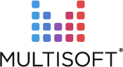
The winning logo is in the form of an M, almost like a stamp that we see signals quality, which permeates all our deliveries. The previous logo's red and blue color was preserved, but here with more nuances in between, which shows how Multisoft spans all the way from the blue analytical to the red creative. It is in this mix that we at Multisoft see technical innovation take shape.
The M is made up of superellipses. A superellipse is a square with rounded corners that balances between the soft human touch that is the focus of our customer service and the hard technical competence that forms the basis of our systems. The different colored ellipses also symbolize just what is unique about us, that our platform is based on a number of building blocks that can be combined into almost any type of system solution.
The fact that our head office is located right next to Sergels torg roundabout, which is a world-famous architectural superellipse, was the icing on the cake. Our logo symbolizes not only Multisoft, but our entire philosophy and ambition regarding quality, customer service and technical innovation.

Knowledge Bank
Curious to read more about our system solutions for, for example, banking, finance, and insurance? Access our exciting tips, guides, e-books, and more in our knowledge bank.
When the membership system begins to limit operations

Member administration that lasts as the organization grows